Tuesday 29 July 2014

Analogue Model 2: Point of Sale Counter

Point of sale is crucial in any form of monetary exchange - therefore is essential for a retail store such as my hypothetical project. For my second analogue model, I wanted to try and model up a potential point of sale counter that fits the minimalist aesthetic. It is in use in places everywhere, but even though it is the place of purchase, there is always the opportunity for displaying more product and entice impulse purchasing. Therefore I wanted to design my point of sale counter with a glass display case inside so that I could do the above. Unfortunately my model was a little top heavy and could not stand on its own - needs more support underneath, therefore I decided not to finish it off, but you get the idea of the design I have in my head..

Again, like the previous model I made, this model is made from foam board..


Analogue Model 1: Steel Beam Wall

Due to the fact that there is a steel support frame in the existing premises that is critical to the structure of the building, I decided to use it as inspiration in order to create a potential recessed feature wall that is made out of the same material and look as the steel beam. I wanted to do a design that would reflect the way in which these steel beams are used within buildings - straight and with crossed joins.. I feel that this would create an interesting aesthetic and in doing so would link it back to the original building. I started this model of so well, however as the cutting progressed, the craft began to suffer a lot lol. This model is made from plain old foam board. I wanted to capture the shadows cast by its form due to the fact that this assignment is all about Ihi and Wehi and thus manipulating light to create a physiological and behavioural response. If I can create large, strong shadows throughout my store to create a strong atmosphere and mood I will do well in designing a store that abides by the notion of Ihi and Wehi.


The pattern of my steel beam recessed feature wall drawn onto the foam board


It is a bit rough, but I have finally cut the pattern out and am able to undertake light tests to see the shadows cast from this form. My idea is that if I am to use this within my retail store, I will have it with a light backing it, or have something like l.e.d strips lights in order to help create an atmosphere and mood within my store. What type of lighting and what colours I would use etc. would be determined later on after I have finalised the aesthetic and mood I want to run throughout my store.


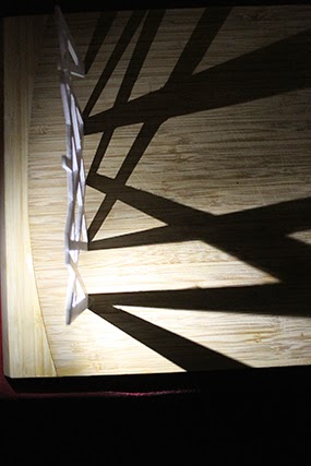
The following images I decided to turn off the lights and solely use a torch in order to emphasise the shadows cast by my model. Due to the fact that this project is centred around the key words of Ihi and Wehi and thus the emotions and behaviour that is associated with these terms, we will be focusing on lighting to achieve this.

I am interested in creating a reasonably dark interior for my store, with downlights or recessed wall lights for example to emphasise particular elements in my store to help create an inviting yet somewhat mysterious mood and atmosphere. This extends from my precedent work and what personally attracts myself into a store. Due to the fact that myself and other men like myself would be my demographic, I feel that by designing a store that would intrigue me into entering would also intrigue other men who would normally shop for the products I would sell. 


Obviously, the closer I have my model to the light, the larger the shadow cast of its form. This is another thing I would need to consider in my store - how large or small do I want the shadows to be?


Monday 28 July 2014

Vans Waffle Sole

I have begun to think about how I am going to manipulate light within my store to evoke Ihi and Wehi (emotional and psychological behaviour) within my customers. Being a casual shoe store, I wanted to link in the form of a shoe within my store in someway. Therefore I thought about what would be the most recognisable branded shoe people would know when they only see the sole of the shoe without actual brand logos or anything on them. I have come up with the idea of using the waffle sole on the trademark Vans shoes as a wall feature or even ceiling feature within my store. At this stage I am still deciding whether it will be a form of displaying shoes, or rather simply be there for aesthetic and to manipulate the light to help evoke emotions within my customers.

The following are a couple of renders using Indigo Renderer after I made the Vans waffle sole in sketch up:


The following images are screenshots of the design process in creating the above renders:
I have sourced this image of a trademark Vans shoe. The waffle sole is instantly recognisable by anyone in my demographic.
It is a bit hard to see, but this is a screen shot as I draw over the image of the Vans waffle sole. This is to help gain a better understanding of how the pattern is fits together and the shapes that I will need to make in order to replicate this sole.
The above screenshot with the image of the shoe removed. For my model of the waffle sole, I will be making the interior of the diamond shapes 60 x 30mm in diameter with a 3.5mm border. It will all be symmetrical as this is a major aspect to the effectiveness of the Vans waffle sole and thus the recognition from customers. 
This is a close up of the arrangement of the diamond shape that the Vans sole is based off of. As you can see it is symmetrical and they run to the edge of the sole. When I have finished placing my diamond shape throughout the outline of the shoe, the borders of each diamond will be protruded upwards to create that recessed look. This will allow for storage, displays or even simply just by combining lighting, for atmosphere and aesthetics.
This screen shot it is clearer to see the outline of the shoe and how my pattern fits within. Something that I have just realised is that since each of this diamonds are individual components, the way that I have laid these out, I will need to use the push/pull tool on every single diamond in order to protrude them outwards. Therefore I will need to delete all of these and restart by protruding one first, and then copying it to create my pattern.
This screenshot is just showing the solution to the above annotation.  
Close up of the diamond pattern. They have been protruded 15mm in this model, however it can be easily scaled later on down the line if I would prefer to protrude the recesses further.
I have now protruded the the border for the outline of the shoe. As you can see, I will need to erase the overhang of each of my diamonds so that they follow the form of the sole of the shoe. For this I will need to explode each of my components in order to erase each section individually..
Following on from the above annotation, this is going to take forever.. By removing the excess overhang of each of the diamonds, I brake the geometry that is the diamond. Therefore once I have erased the lines, I have to go back to the diamond and fill in each 'broken' part in order to make the geometry's new shape whole again.
It took a few hours, but I finally created the shape and all of the geometry is unbroken. I have turned shadows on in order to create that sense of depth within the recesses.


Sunday 27 July 2014

Sketch 5: 'Hanging Shoes'

In taking the gallery idea from the previous post, I have also thought about creating an installation in which styles of shoes hang from the ceiling throughout the store. The store is recessed into the ground in which the customer walks down the stairs to enter the store. This enables the shoes to hang from a higher height without the need to use the second floor. The idea behind this concept and all of my other concepts is to make customers view the footwear that I would sell, not just as something that you wear on your feet, but it is a piece of fine craftsmanship that needs to be appreciated and adored. 

This concept is slightly different in the fact that there is no seating for customers to fit sizes - it is all part of the experience. Therefore they can either kneel or stand to get their shoes on. Sizes would fill the back wall from top to bottom with large ladders on runners (I forgot to draw these in) for staff to get sizes down for customers. To be honest, I don't think this is my strongest concept, however it is just another way of looking at this project and in turn, another potential direction I could take it. 


Sketch 4: Gallery Floor

This idea spanned from the previous in the form of having the shoes I would sell displayed like art pieces in the store.. The 'gallery' would be curated with the newest arrivals but the store would only sell between 3-5 different style shoes at a time. The style / aesthetic of the shoes on sale at a particular time will change from month to month or week by week. A grand entrance way leads into a dark room where the display shoes in a locked glass case are illuminated by down lights from the ceiling. All emphasis is on the display cases. The walkway would be paved through the gallery by recessed under floor lights to guide customers upstairs where they would then fit sizes.

Minimalistic design, nothing in the design but what is absolutely needed. 

Sketch 3: Chasm

I really quite like this idea - however I am not sure how feasible it is.. This idea revolves continues around the idea of making the displays of the shoe the focal point of the store, like they are an art piece. When a customer enters the store they are met with a dark room with recessed floor lights leading them to the displays that is metres above the fitting area below. It is if the fitting area is cut out of the ground creating a chasm below the display area. Two sets of large grand staircases lead down to the fitting area below which is illuminated by lights hanging low from the ceiling high above creating atmosphere and a sense of being belittled in the vast chasm. 

As my annotation states; if I look into progressing with this idea any further, I would need to look into how deep the 'chasm' could be without compromising the structural integrity of the building and those surrounding it too. 


Sketch 2: Circular Floor Levels

This idea is revolved around the idea of having a central recessed point in the store in which all of the shoes are displayed. When one enters the front door, they then walk down into the 'pit' to choose a shoe then up through to the top level for fitting and purchasing. The purpose behind this sketch idea is to direct and control the flow of foot traffic from customers and give them a unique shopping experience.


Sketch 1: 'Dugout'

So my idea behind this sketch was to create a baseball inspired design in which the store is on three levels. The ground floor would be where the table to display the shoes and point of sale are, the fitting areas are like 'dugouts' which are recessed into floor by a meter or two, and storage for sizes are on a floating floor that also works as the ceiling for inside the dugout. I would line the store with chicken wire in order to abide by the notions of Ihi and Wehi and to emphasise the aesthetic and design that the store is based on.  

I am interested in this idea due to the fact that if the fitting areas are recessed into the ground, the ability for natural light will be quite low, therefore I could experiment with artificial light in order to help create a moodiness and a more overall experience when trying on my shoes. 


Recessed Seating Sketch Idea?

These are woeful sketches I know but I did them really quick, I was just trying to get on paper some ideas to start sparking my brain into recessing the floor or walls for either storage or fitting. Due to the extremely limited space, I feel that by recessing the walls and/or floor will be very helpful for me to make the space seem larger than it actually is.


Spatial Generator Term - Recess

According to Oxford Dictionaries, recess is coined: 

A small space created by building part of a wall further back from the rest:
'a table set into a recess'

This is exactly what I want to achieve within my own design, due to the fact that the amount of space that is available is extremely limited, I will need to take full advantage of the space that I can create by recessing some walls for potential storage, or even lighting to create mood and atmosphere within the store. My precedent - Bestias XX do this very well, I want to take inspiration from their storage technique and incorporate it into my own design.

Precedent 5: Bestias XX

Store: Bestias XX
Location: Santiago, Chile

I absolutely love this precedent the way in which they have designed the storage within this tiny space and bringing it back to their branding XX is quite stunning. I want to use this idea, not replicate it, but I feel like I want to combine this precedent with my second precedent - Double Monks. I want to make the storage come out of the wall.. And due to the range of brands I will be selling, the different shoe boxes - both their respective colours and style will create a really effective and aesthetic sight.

To create a really effective elongated store bringing emphasis on the shoes I will be selling I may raise the ceiling and bring the walls in a little bit more..?  


Friday 25 July 2014

Wellington Archives

So my task for the glass was to head down to the Wellington Archives and see if I can source some building plans of our site - 128 Tory Street. I have been with in liason with Shirin there, and with consultation with Ant, we cut the list of documents to view from twelve to two. The two documents I have looked at and pulled information out of are:

  • The original drawings of the site back in 1906
  • The earthquake strengthening permit that was conducted in 2011
Unfortunately there was not a lot of information that would be relevant to our project so I have had to cull it to the following drawings that I have copied for the class:

Original Drawings 1906:
I'm not really sure what this is a drawing of due to the fact that there were not annotations or dimensions within these drawings.. However I would presume that this may be a potential facade/veranda over the footpath due to the decline of the drawing. This would correlate to the steady decline of Tory Street.

Long section of the premises. 
Potential cross sectional elevation?

Second floor plan.

First floor plan.

Earthquake Strengthening Permit 2011:

Summary of strengthening - drawing of the structural beams within the premises,
Location plan and existing roof plan. 1:500 and 1:100 scales respectively, 
Existing ground and first floor plans. 1:100 
Existing sections focused on the structure of the building.
Proposed ground and first floor structural plans.
*See key for more information
Proposed roof plan. Parapet strengthening
*See key for more information

Proposed sectional strengthening.
*See key for more information